APP DESIGN WITH JOY
great app design DELIGHTS YOUR USERS
Clients typically come to us with just an idea and we can immediately give them guidance on what to do next as well as a ballpark estimate. Most projects start with our team hearing out the idea in full, asking questions and having a lively discussion with our design and technical hats on. If you are in need of some advice on your mobile app or SaaS project idea, feel free to contact us right now.
Starting from a blank sheet of paper can be liberating and creative. Exploring new territory without the boundaries of old is full of hope and possibility. It becomes possible to make something new. Surely, this is the space where innovation is born.
However, the road to innovation passes through the barren landscape of uncertainty because starting from scratch is daunting. You have nothing to work from, no existing framework to build upon - just your own unproven, unfinished ideas. It can feel empty and uncertain.
It helps to have someone with confidence and experience by your side; someone with a roadmap for the journey ahead. Great design happens when we combine your ideas with our experience and process.
Mobile app design starts with us listening to what you are trying to achieve. We need to understand what is important to you - the goals, values and principles in your project. You don't need to explain this in technical detail; that part is for us to guide you through. Instead, feel free to focus on telling us about the goals and outcomes you are trying to achieve with your app or SaaS project. Are you trying to improve your business? Do you see an opportunity to raise productivity in your industry? Are you trying to make people's lives easier or change the world?
Book a free consultation now
We’ve been in this business for over 10 years, and with all that experience we now use a modified version of the Design Sprints process tailored specifically to New Zealand and Australian start-ups.
We will immediately start picturing your idea in terms of User Experience (UX), User Interface design (UI), Conversion Optimisation (CRO), information architecture, database connections, speed, complexity and other technological considerations. We can consider a diverse range of these factors, while zooming in on any specific area of focus in a relatively short workshop. We find this combination of focused and diffused thinking early on provides the flexibility to innovate, while also establishing a technical rigour.
At this stage we would also explain to our client the benefits - and we would argue the necessity - of Minimum Viable Product thinking for bringing new ideas to market as quickly as possible, with the minimum amount of risk and getting feedback from the market in order to iterate into a winner as soon as possible.
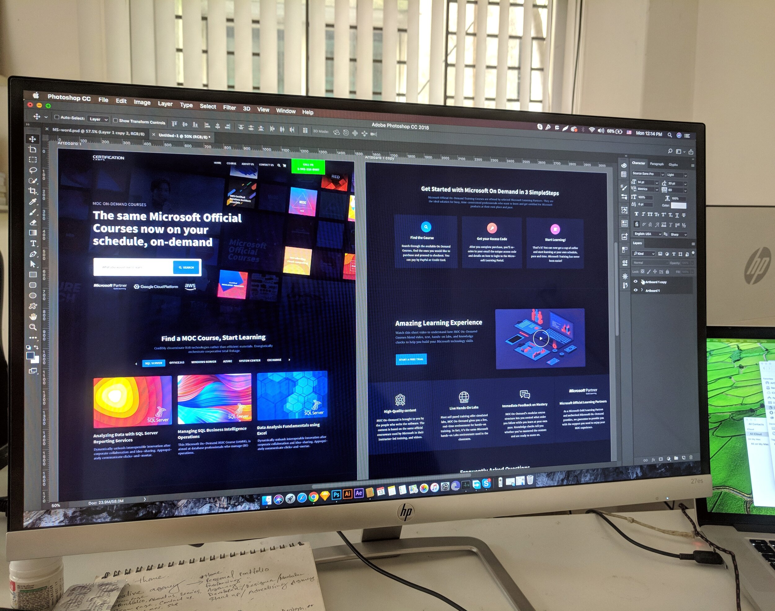
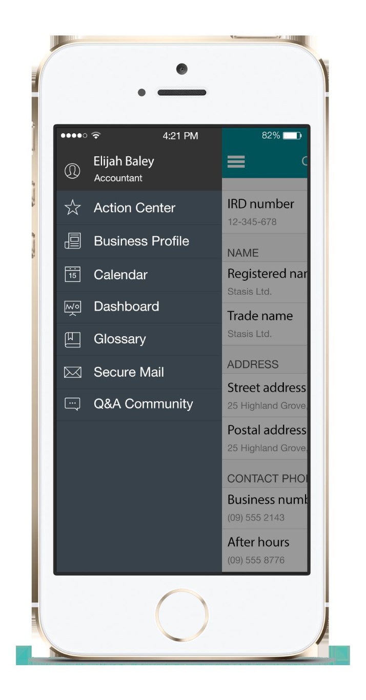
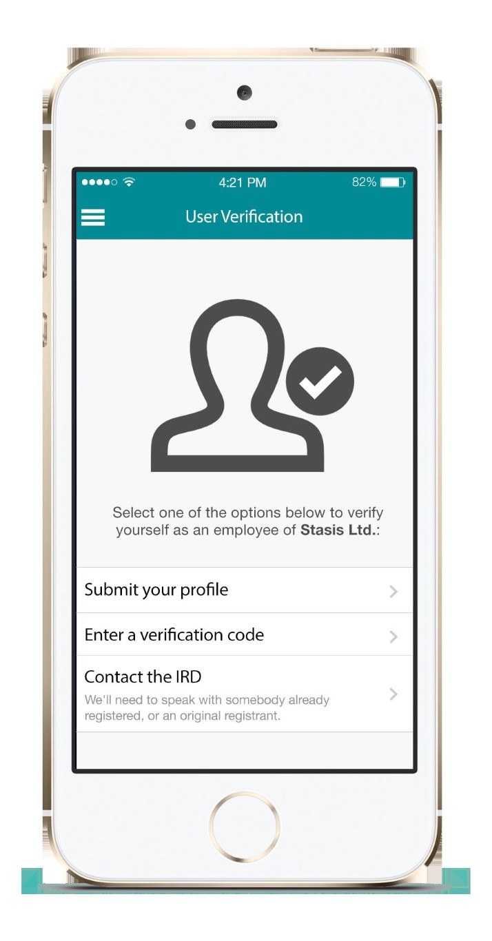
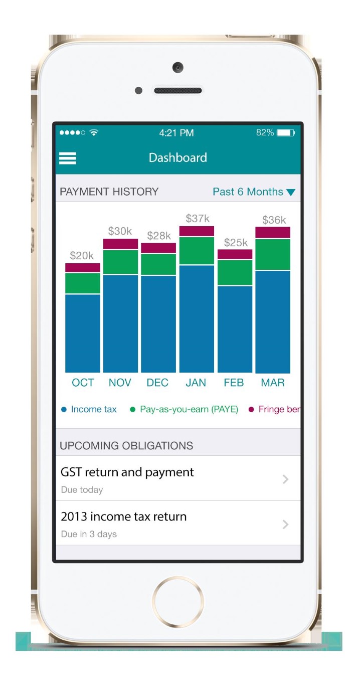
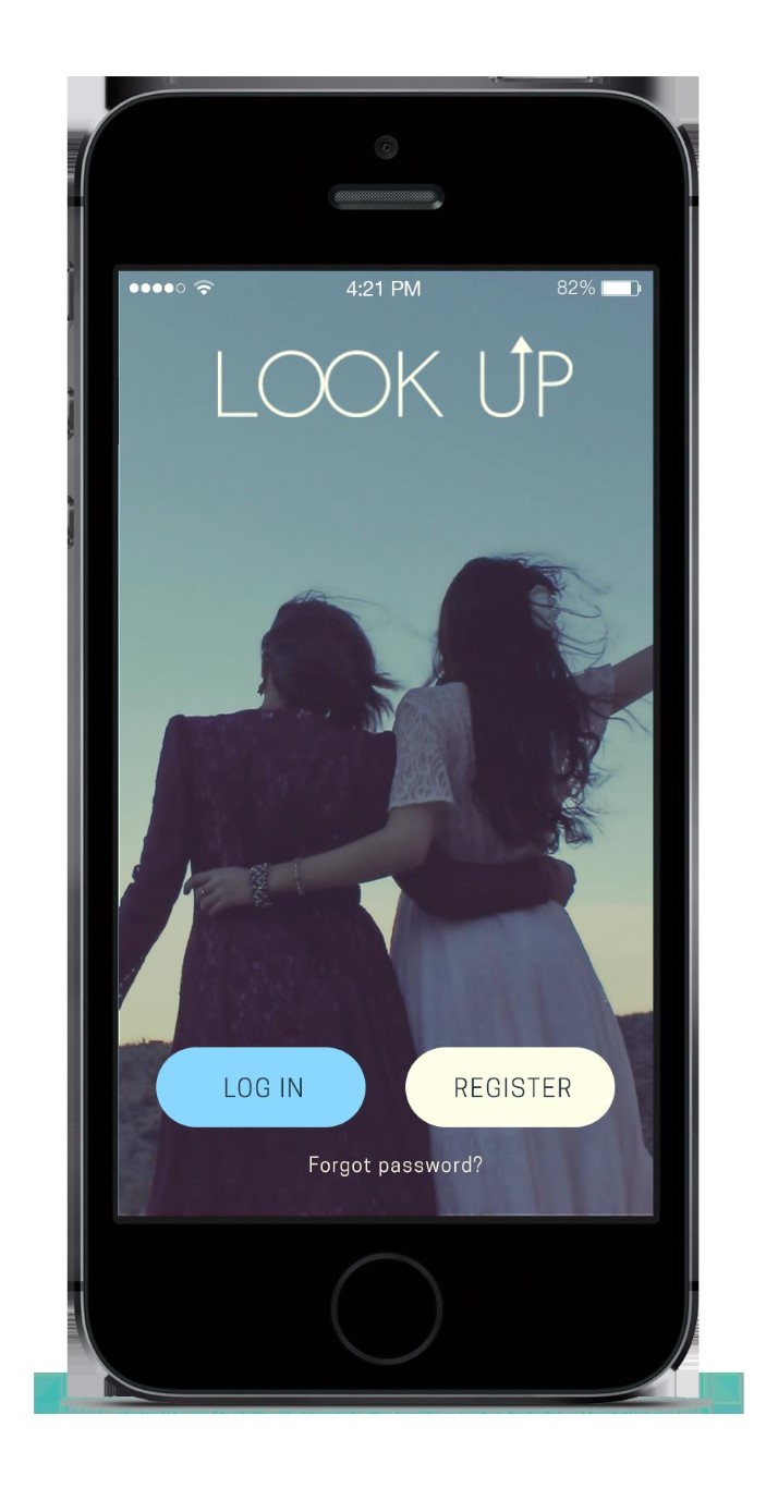
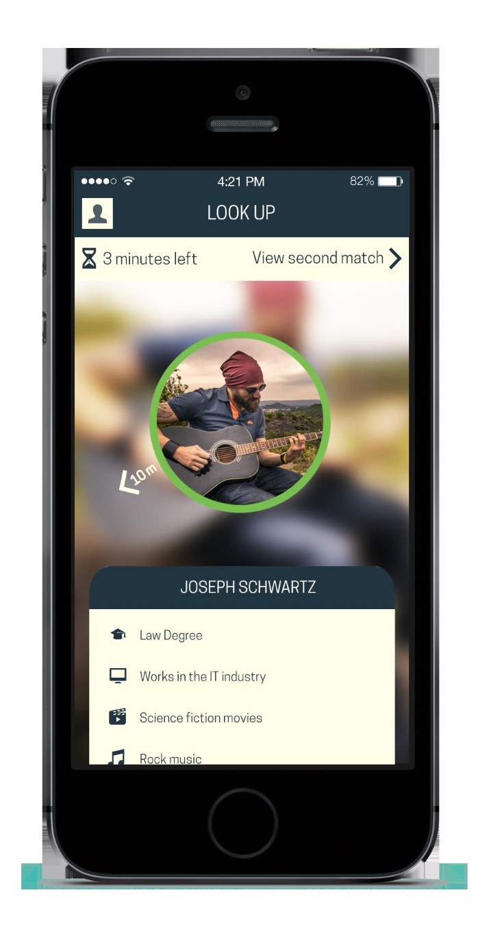
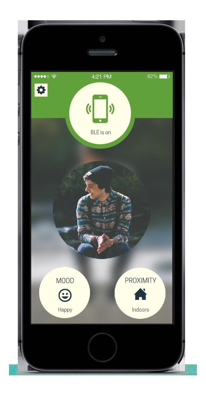
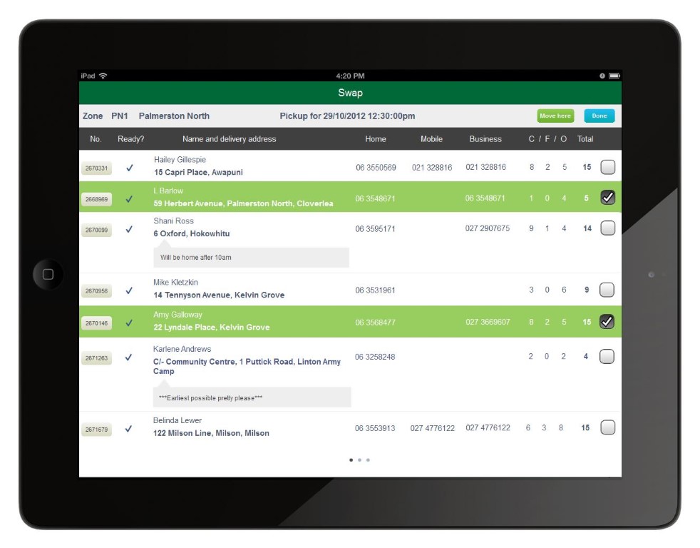
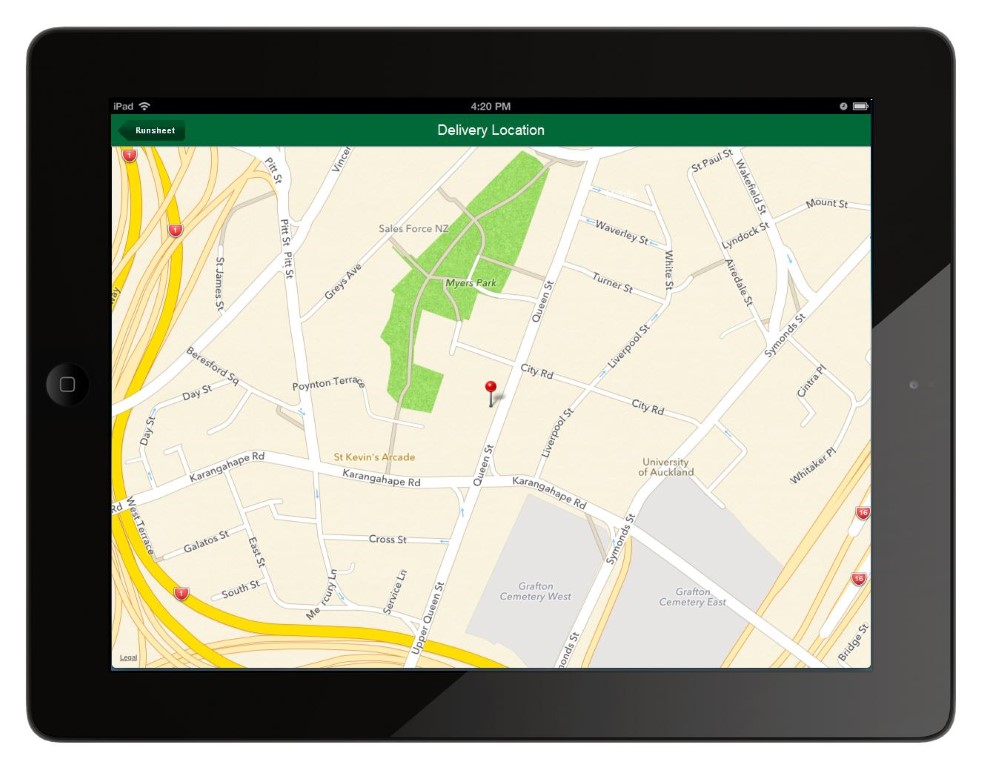
Once we have a good idea of your app requirements, we would design a pixel-perfect, photo-realistic user interface mock-up in order to visualise your idea in high fidelity. This is typically a very exciting moment for our clients, as they get to see their app idea in full colour glory for the first time.
The thinking really starts flowing at this stage, as you are no longer working from a blank sheet of paper. Having a high-fidelity mock-up in front of you brings out more ideas and enables you to start thinking more critically — “maybe this function should be moved elsewhere, and maybe we don’t need this in version one”.
We would discuss your feedback with you and make changes to the design until you are happy with the look and feel of the app. For more complex projects we may even create a high-fidelity prototype. Later we would work on the detail of the design - corners, buttons, fields, colours, transitions - to finalise the UI and UX.
It is important for mobile and SaaS app design to be beautiful and user-friendly. Consumer apps should be kept up-to-date with current UI and UX trends, because users’ expectations of an in-app experience change as they are exposed to updated app designs from all over the world. Mobile and SaaS apps should never require a user manual because users demand to be delighted with magic at the push of a button.
