Welcome back to our series, "The Secrets to Conceptualising, Designing, and Creating a Mobile App for 2024". If you've read our first post, you know that 2024 is an excellent year for diving into the mobile app market. Today, we're moving onto one of the most vital stages of your app journey: validating your idea.
You might have a brilliant app idea, but how do you know it will fly? More importantly, how do you persuade investors and stakeholders to put their time and money into it? The process of validating your app idea helps to answer these questions.
Methods for Validation
There are four methods to validate your idea and I personally like two of them.
Method 1: Surveys
One of the most straightforward methods for validation is to create a survey. Tools like Google Forms or SurveyMonkey allow you to craft a questionnaire aimed at understanding potential user needs, preferences, and pain points. Distribute this survey to your target audience via social media, email, or community forums.
I have to be honest, this is my least favourite way to validate an idea because I think it gives the least reliable data for two reasons:
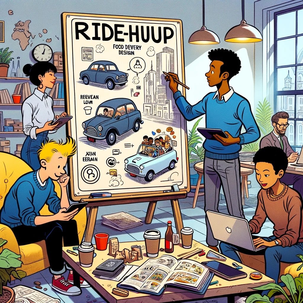
People typically find it difficult to imagine a new product described in words - until they see it, especially if it is in some way innovative (which it should be). As Henry Ford famously said: “If I asked what kind of car people wanted, they would say they want a faster horse.”
It is difficult to get people’s unfiltered opinions, especially if they know it is about something close to your heart. People have all sorts of motivations to say one thing but do another. That’s why it is far more accurate to observe people’s behaviour rather than their words.
Method 2: Landing Pages
Another effective technique involves setting up a landing page for your app. Include an overview, its features, a partial design and a call to action like "Sign up for updates" or "Get early access". Keep an eye on metrics such as page views, conversion rates, and bounce rates to measure interest in your app.
This is in my opinion a better way to validate an idea, as you get to observe people ‘voting with their feet’ or their mouse clicks and sign-up actions instead of just words. If people are interested in your idea they will sign up for updates. However, if your idea takes some wrapping their heads around, it may be difficult to explain via a simple landing page.
Secret Tip: Use Small Ad Campaigns for Quick Validation
While the methods above are reliable, here's a lesser-known tip to validate your app idea quickly. Run small-scale ad campaigns on platforms like Facebook or Google, directing people to your landing page or survey. Set a modest budget and focus your target audience to match your ideal user profile. These results can give you a rapid snapshot of the market demand for your app, sometimes in under a week.
Method 3: Prototyping
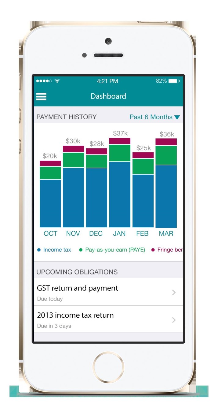
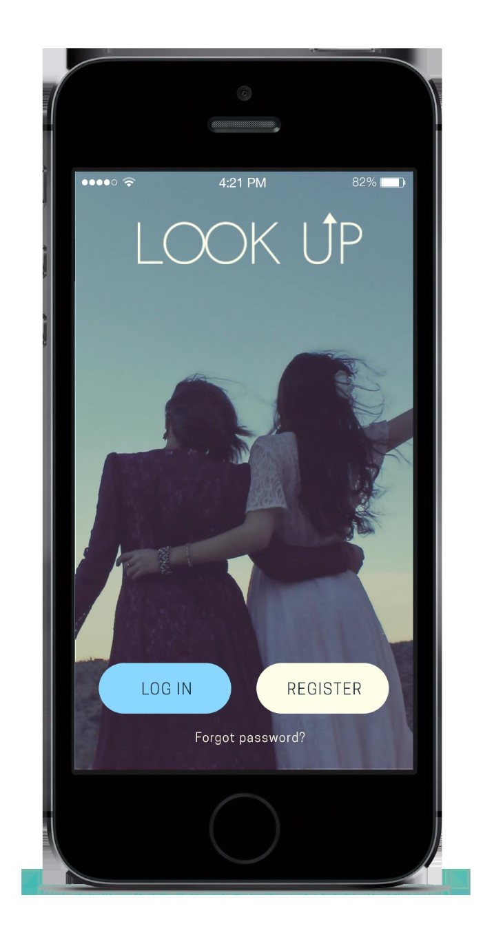
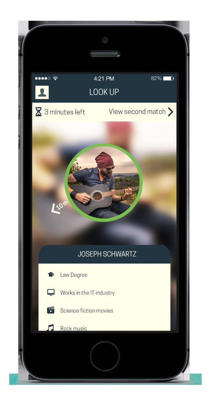
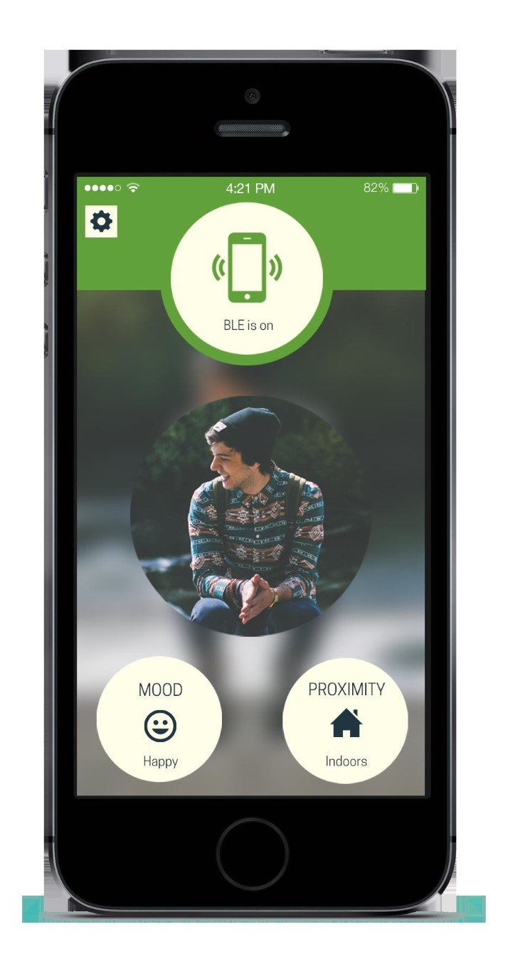
My personal favourite way to validate an idea is to design and build an interactive prototype. This would not be a functional app, but visually it would be as close as you could get without breaking the bank. The only more thorough method of idea validation I can think of is building out a functioning MVP (see below), but this is a process at least one order of magnitude more costly than prototyping.
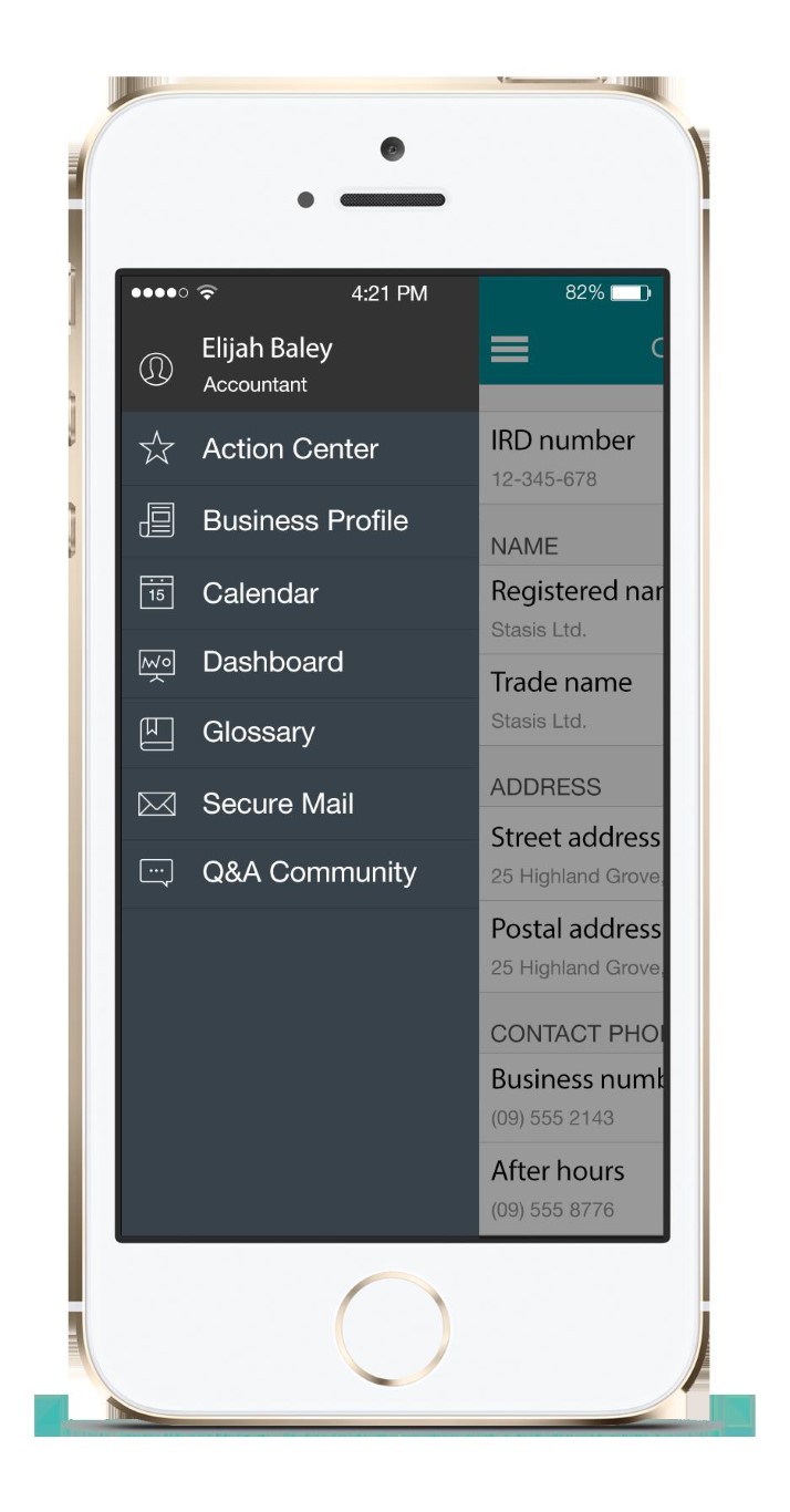
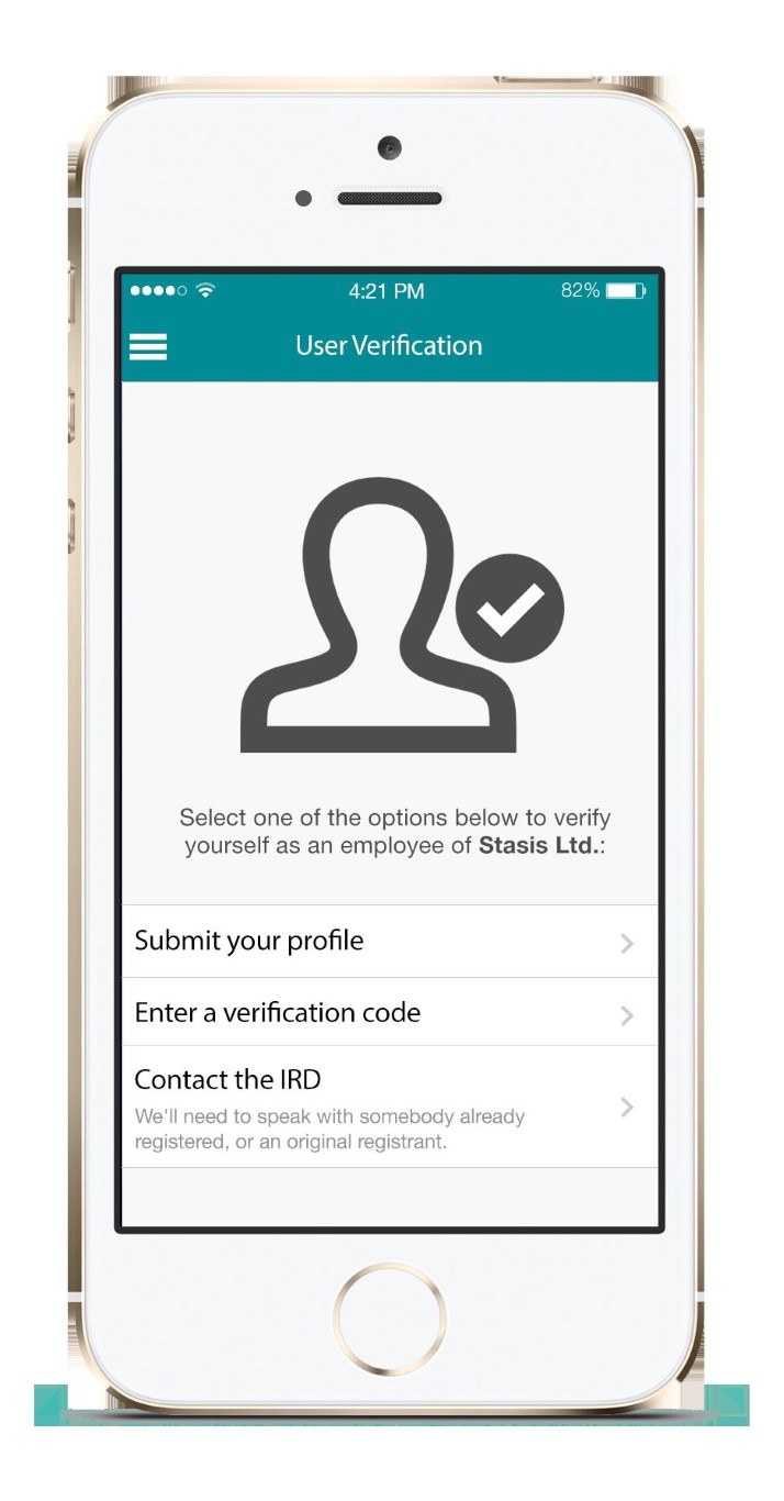
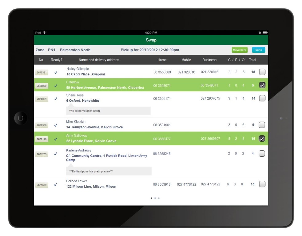
A prototype isn't a functional app, but it simulates the user experience and flow. You can create it as a simple sketch or a detailed wireframe, but for maximum impact I recommend creating a high-fidelity interactive model. This way you can show potential users your exact product design. This preliminary step allows you to gauge the user experience, identify potential issues, and make necessary adjustments. Importantly, a prototype can offer insights into the app's usability without requiring any coding, saving you both time and resources.
Figma is what our design team uses for prototyping, but if you are familiar with Adobe products, Adobe XD also has prototyping features. There are other alternatives available also, such as Canva, Marvel, InVision and others.
But how would you go from an idea to a prototype? Let’s break it down and walk through the process that we use at MULI. We have adapted our own version of Google’s Design Sprints methodology, which goes like this:
Understand: The first phase involves gaining a deep understanding of the problem you're trying to solve. Here, research is key. We examine market trends, user behaviour, and any existing solutions to form a comprehensive view of the problem landscape.
Define: After understanding the problem, the next step is to clearly define your app’s objectives, target audience, and success metrics. This phase sets the roadmap for the sprint, ensuring everyone is aligned and focused.
Sketch: The creative juices start flowing during the sketch phase. This involves producing a range of potential solutions through brainstorming sessions. We encourage divergent thinking among the project team to explore various pathways before converging on a few workable ideas.
Decide: Among the myriad ideas generated, it's important to decide on the one that aligns most closely with your defined objectives. The team collaborates to select the most promising concept that will move into the prototyping phase.
Prototype: This is the hands-on phase where the selected idea takes a tangible form. Using Figma, we create a simplified version of the app focusing on the user interface and experience. This prototype is not feature-complete but aims to simulate the user journey and core functionality.
Test: In this phase, the prototype is put to the test. We conduct user testing sessions to gather firsthand data on usability and efficacy. This helps us identify any shortcomings, areas for improvement, and quite often reveals helpful ideas we might not have thought of before.
Iterate: Armed with user feedback, the prototype undergoes refinement. Depending on the results, this could range from minor tweaks to a major redesign. The goal is to continually improve until the prototype is aligned with both user needs and business objectives.
The hardest part in my experience is starting with a blank canvas because there are so many directions you could go. If you are not sure, or if you feel you don’t have enough experience in the area, my advice is to either learn from others - via market research, speaking to people who have done similar work - or by gaining first hand experience via experimentation. Don’t be afraid to try things — be afraid of getting stuck with a blank canvas!
Method 4: MVP (Minimum Viable Product)
If you're willing to invest more time and resources, constructing an MVP can offer valuable insights. An MVP is a basic version of your app, featuring only the core functionalities. Launch it to a smaller audience and collect feedback to understand what works and what needs improvement.
It sounds simple, but building a Minimum Viable Product means building a functioning app. And building a functioning app means building an app that could potentially scale, should it take off. This in turn means the work needs to be thought through and planned - from the database structure, to the business logic, to the UI/UX design.
The typical cost to do this? $50-100K. It is not a trivial cost, so as I’ve said above, you may wish to look into other means of validating your idea first. My favourite one is by prototyping.
Learning from the Data
Once you've collected data through surveys, landing pages, or an MVP, it's time to interpret the results. Search for trends that can either validate or refute your initial assumptions. For instance, if a majority of survey respondents indicate they would pay for an app that solves a specific issue, that's strong validation for your concept.
Taking the Next Steps
If the data backs your idea, you're well-positioned to progress to the next phase of development. However, continue gathering feedback as your app evolves. User needs change, and what’s relevant today may not be tomorrow.
Validating your mobile app idea is a crucial stage that can save you substantial time, money, and effort in the long run. It allows you to refine your concept, understand your target audience better, and lay a solid foundation for further development and funding.
We hope you've found this post to be both informative and actionable. Stay tuned for the next article in our series, where we'll delve deeper into mobile app design, offering you a combination of standard best practices and some lesser-known tips and tricks.
Thank you for continuing with our series. By its end, we're confident you'll have the arsenal you need to make 2024 the year your mobile app not just launches, but excels.

