How would you feel if you invested $1.75 billion in an app that did not get how its users wanted to use their phones?
That’s exactly what happened at Quibi, the Hollywood-backed short-form content start-up that crashed and burned within 6 months of launch.
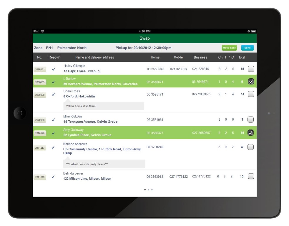
Design has always been fundamentally important to product creation, and this has never been truer than in the smartphone era.
To drive my point further, here is a list of recent big-money start-ups that failed largely due to poor design choices:
Clinkle - This mobile payments startup raised $30 million and attracted a lot of attention but suffered from poor design and functionality, eventually leading to its failure.
Color - Raised $41 million before even launching, but the app's confusing interface and unclear value proposition led to its downfall.
Path - Despite raising over $65 million, Path had poor design choices that resulted in privacy concerns and usability issues.
Secret - An anonymous social networking app that raised over $35 million, Secret's design contributed to negative user behaviour and its eventual shutdown.
Hailo - A ride-sharing app that garnered over $100 million in funding but had a confusing user interface which hampered its adoption rate.
Airtime - With $33.5 million in funding, Airtime suffered from poor user experience and underwent multiple relaunches.
HomeHero - Raised around $23 million but struggled with app usability and eventually closed its doors.
Ello - Despite raising $11 million and being touted as the "anti-Facebook," Ello's sparse and confusing interface led to its downfall.
How’s that for a reality check?
I will repeat: design is absolutely fundamental to the creation of a new product, and this is truer than ever with mobile apps.
Welcome back to our series, "The Secrets to Conceptualising, Designing, and Creating a Mobile App for 2024". In our last post, we delved into the nitty-gritty of validating your app idea, a crucial step before you invest any further resources. Today, we're shifting gears to another indispensable component of mobile app success: the art and science of design.
Good design is not just what looks good - it is also about what works well. And in the case of mobile apps, the design can often be the difference between a massive user base and a digital tumbleweed scenario.
Basics of UI/UX Design
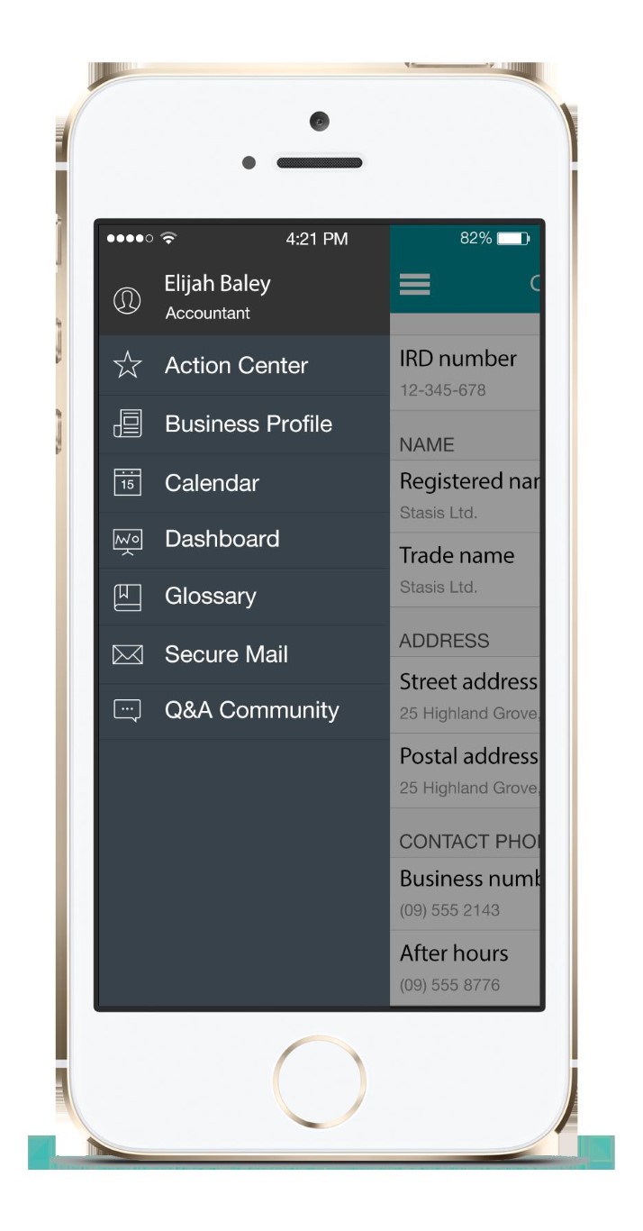
UI (User Interface) and UX (User Experience) are two sides of the same coin. UI is about the look and feel of the app—how each element appears on the screen. UX is about the user's journey through the app—the how and why they interact with those elements.
Start with your target audience. Your design needs to reflect the preferences and expectations of your user demographic. Use data analysis to make informed decisions; it’s the backbone of good UX.
User Flow
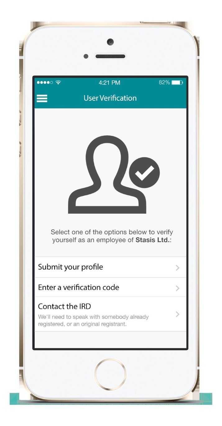
User flow is the roadmap that users will follow when navigating your app. Designing a straightforward user flow minimises confusion and encourages users to complete actions that benefit your key performance indicators (KPIs). Use wireframes to sketch out each screen, connecting them in a way that feels intuitive. This can serve as a blueprint for your developers and designers alike.
A Controversial Take on A/B Testing
A/B testing can be a potent tool, but it isn’t always the magic wand that many claim it to be. In scenarios involving 'high-barrier' conversions—such as handing over money or personal details—A/B testing for trivial design elements like colours or button sizes is generally a waste of time. In these situations, users are more likely to focus on the content, making it essential to answer their questions and overcome objections.
However, A/B testing can be highly effective in 'low-barrier' scenarios—like simple sign-ups for a free account—where users may be less attentive, and subtle design improvements to guiding users along visually can have a significant impact.
The Three Click Rule
Here’s an unusual trick: abide by the 'Three Click Rule'. The principle is straightforward—any action a user wants to perform on your app should be achievable in no more than three clicks or taps. The quicker a user can complete their intended action, the happier they are, leading to increased user satisfaction and retention.
Design Sprints: Our Secret Sauce
At this point, I must introduce you to our Design Sprints service. Our process culminates in an interactive prototype and includes stages like Understand, Define, Sketch, Decide, Prototype, and Test. It's an accelerated way of getting from a product idea to a prototype that can be tested with actual users. This process serves as a critical method for both validating your concept and refining your app’s design.
Prototyping
Prototyping is a key component of our Design Sprints. It includes sketching out the initial interface, creating a mid-fidelity prototype, running usability tests, and iterating based on user feedback. It offers a fast, cost-effective way to visualise your app and make sure it aligns well with user needs before diving into full-fledged development.
Effective mobile app design is a blend of art and science, intuition and data. It’s about making choices that look good but also serve a functional purpose. Keep your users at the centre of your design philosophy, use data to guide your decisions, and never underestimate the power of a good design hack to give you an edge.
Stay tuned for the next post in this series, where we'll tackle the technical side of things: how to choose the right tech stack for scalability.


